When I took my first photographs, black and white was far more common than colour, which was horrendously expensive; today most people use digital cameras and produce by default colour photographs. Yet there’s a lot to be said for black and white – and not just for its novelty value. So, what are the advantages of black and white?
It’s an interesting question, because most painters do not paint in black and white. There are charcoal and pencil sketches, and some graphic art type work, but in the main those painters whose subject matter overlaps with photographers have used colour. Originally, photographers had no choice, although it was not very long before hand tinted photographs were available, even if colour film did not exist. Cost may have limited their appeal, but then initially any photograph was expensive. Clearly, there is some appeal in mono.
I’d like to start by considering what makes a good image. Why do we like some images (I don’t care at this stage if they’re photographs, sketches or full blown oil paintings) and like others less, or not at all? That’s after allowing for not liking certain styles at all – I’m happy to allow someone to hate Jackson Pollack and love Turner, simply because they are very different styles. If we look at an image that we like through half closed eyes, such that the colour (if it existed in the first place) has all but disappeared, do we find the image far inferior (possible exception: Piet Mondrian)? I’d suggest that in many cases we don’t. What attracted in the first place was more to do with the shapes and forms, and less to do with the colours. Even Mondrian retains his force in a black and white reproduction.
Now, what do you know about composition? Think back to what you’ve learned; consider what you’ve read. What comes to mind? Rule of thirds, lead in lines, arrangement of shapes, balancing objects on an invisible “balance” to make sure that the composition isn’t one sided and so on. Where does colour come in in all this? It doesn’t. Years ago, when most photographs were taken in black and white, magazines used to have a special once a year colour issue. They’d cover then the “rules” for composing with colours – things you’ll find in any artist’s primer, but rarely see mentioned in the photo press nowadays
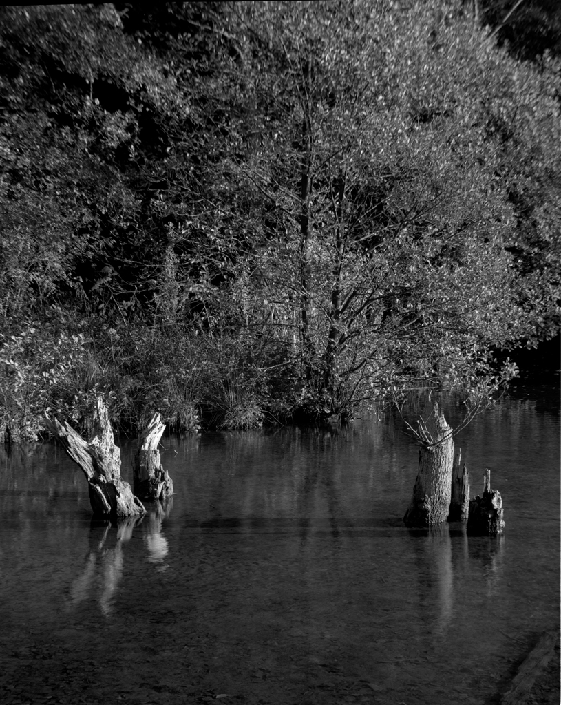
Sometimes, colour may establish a mood different to the one you would like to establish – it may work against your intent. This photograph from Dalby Forest in Yorkshire works better without the brown and muddy-looking water in the foreground being seen as it was. Without colour, it is much cleaner and brighter.
If we ignore photography where colour is necessary – not that many places, all things considered – why black and white? What can it offer above colour, if we’ve already said that the rules of composition apply to both?
In the first place, it works on the “less is more” principle. You’re standing in a beautiful location, and you want to photograph the landscape. Now, I’ve always said that when you reach this point, the first question to ask yourself is “why?” so that you know how to select the viewpoint and compose the photo. But let’s step further back, and ask – was it the colours that attracted you, or was it the scene as a whole? Do you think it looks much better in colour than the view you’d get if you were colour blind – or even viewing it through tinted sun glasses that reduce colour differences anyway? The chances are that it’s the scene independent of its colouring. Removing the colour removes a distraction, and lets the arrangement of objects come to the fore, unencumbered by colour.
Secondly, the elimination of colour lets graphic elements stand out more. You can consciously arrange tones and masses – even areas of pure black – to make a harmonious whole. Texture stands out more in black and white; it becomes easier to imagine actually feeling the surface. We see the subject “as it really is”, rather than with colour associations bolted on.
Removing colour sometimes makes it easier to appreciate a photograph of an object, because it makes it more of an abstraction; knowing what an object is like can get in the way of appreciating a photograph of it. One of the greatest difficulties photographers seem to face is seeing what is really there, rather than making assumptions as to what is and isn’t present. Hence the people you never saw in the frame, just where they shouldn’t be for best effect; the post growing out of someone’s head. This sort of assumption can also affect us when we view the photograph, and removing the colour concentrates the attention on the substance more than the accidents.
Freedom to interpret
A colour image appears on the surface to reflect reality – most of us see in colour, after all. So, the image has a greater realism, but there is also a greater expectation that it will reflect reality. There is very little that can be changed in the way of contrast and tonal range – to say nothing of the relative brightness and hues of parts of the image – without the result looking unnatural.
In contrast, removing the colour divorces the image from reality, which makes it possible to apply our own stamp on it without the result appearing unnatural. We can modify tones, change the contrast of parts of the image and add emphasis where we want all without making the result appear false.
From the point of view of someone who wants to express themselves through photographs, black and white offers far greater scope. You can adjust tonal values to be very different from the original, and yet still look realistic. You can’t get away with this in colour. The degree of manipulation that gives an image that characteristic “HDR unnatural” look can be exceeded many times over in black and white, without the viewer being aware that anything has been done. You can impress your view on a photograph, and yet it can still look like a “straight” photograph.
By dodging and burning it is possible to concentrate the attention on the parts you want to emphasize, not the parts with the brightest colours. Colours are great attention grabbers – see how many warning signs are in red – but the main point of interest in an image may not be in the most appropriate colour. Put the obligatory figure in a red anorak into a landscape as the foreground and/or “object for scale” and what part of the resulting photo captures and holds the attention? It’s all too easy to intend a landscape and produce an environmental portrait.
On a more personal note, why do I use black and white? Initially, I’ll admit, it was cost. A cassette of Kodachrome cost 6 times as much as a black and white cassette; and in those days before the one-hour mini labs, colour print film cost even more. My mother did persuade me to try a 36 exposure Kodachrome, and I used it mainly on flower close ups. I liked the results, but without a slide projector, the results were awkward to view, and by that time I had had an enlarger for 4 years and was well into black and white enlarging. Colour slides left me with little scope after initially pushing the button.
I did embark on a lengthy “colour slide only” period, after Ferraniacolor appeared in bulk loads and easy to use processing kits came along at the same time which together made slides a significantly cheaper option than before. I also lacked darkroom facilities at this period, which made this the easy option. I did try Cibachrome (prints from slides) and obtained some good results; but with no real possibility for influencing them in the way that I knew I could with black and white.