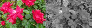
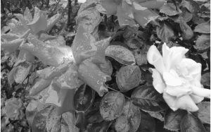
When making a black and white photograph, we have to remember that vastly different colours, that make objects easy to distinguish, do not necessarily convert to different shades of grey. The textbook example is a red rose with green leaves. Left to the normal rendering of colours in black and white, the red and green will appear as similar shades of grey as can be seen below.
An additional problem is that films do not match the spectral sensitivity of our eyes, and some colours will render darker or lighter than we might expect. Film makers publish graphs for their films which show the spectral sensitivity, and it can be seen that the response across the range not only does not match the response of the human eye, but isn’t even across the range. We need some way to address this if we want complete control.
This is why coloured filters are the stock in trade of black and white film photographers, which are used to alter the relative tonal values of the colours. These filters are usually referred to as “contrast filters” because they are used to increase the contrast between objects that are different colours but would, if left unchanged, be rendered as the same or similar shades of grey.
Contrast filters are not needed with colour film or digital cameras (indeed, their use brings only disadvantages). In digital photography, all the coloured filters can be simulated in Photoshop, which is by far the best way to handle conversion to black and white. For film photographers who intend to scan and print digitally, a good case can be made for the use of colour negative film as the basis for black and white prints. Starting with a colour image allows the greater versatility of image processing software to be used, rather than the more basic in-camera options; it allows selections to be made based on the colours, and no filter factor is needed. It also saves the expense of buying the filters, and removes two surfaces that could increase flare. I’ll have more to say about this later, where I’ll put the other side of the case.
A red filter will pass red light, and stop blue and green although as we’ve seen in the previous chapter in the section on black and white films, all objects will reflect at least a small amount of every wavelength contained in the light that illuminates them. We might be able to filter out all but the red light, but green and blue objects will still not be rendered as black.
The textbook example is a red rose with green leaves. Left to the normal rendering of colours in black and white, the red and green will appear as similar shades of grey as can be seen below.
In the pair of photographs above, the roses clearly stand out from the leaves when colour is present; converted to greyscale in Photoshop the result shows very little differentiation. Using a red filter lets the red pass freely, and reduces the brightness of the green, giving a pale flower against dark leaves. A green filter gives the reverse effect. If we simulate the effect of using red and green filters in Photoshop, the contrast is restored, but with very different end results.
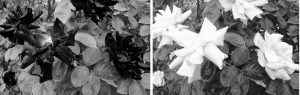
A red filter lightens the roses considerably, whereas the green filter makes the petals almost black. Using less extreme filtration (or Photoshop effects) enables the effect to be precisely selected.
Many different coloured filters are used, each with their own effect. The one thing that they do have in common is that, as they absorb some of the light, an increase in the exposure is necessary. Cameras which have through the lens metering should allow for this automatically (assuming that the meter’s spectral sensitivity isn’t fooled by strong colours), but those setting the exposure using a hand held meter will have to make an exposure increase, which depends on both the filter and the colour of the light source. There’s a guide to the required increases at the end of this article.
With landscapes that include the far distance, and particularly at higher altitudes, heat haze can obscure the distant details. The haze is bluish in colour (distant views look bluish) and if you reduce the blue light reaching the film, the amount of haze can be reduced.
The final general point to make is that although I talk about “yellow” filters, “red” filters and so on, in practice all contrast filters come in more than one variety even for the same colour. You’ll find filters designated “light” or “medium” or “dark”, depending on the strength of the effect, and you may wish to have more than one variety available to use depending on the circumstances.
The effect of using filters
Before looking at the different filters, let’s see the simplest possible example of three coloured circles passed through Photoshop.

The circles are shown “as is” and then as they appear when converted to greyscale in Photoshop. The colours, while not being exactly the same shade of grey, are very similar. If we photograph the circles through blue, green and red filters, and then convert to greyscale the results are rather different.
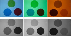
The blue filter has darkened the red, while leaving the green more or less the same; the green has lightened the green circle, and darkened the red more than the blue; and red filter has clearly made the blue circle much darker, while the red is lighter.
That illustrates the general principle that a filter will lighten its own colour, but is hardly a real world example. So let’s see an actual example with a colour photograph passed through Photoshop.

I chose the above photo because it contains red, green and blue elements, which will make it easier to see the effects of adjusting the relative brightness of colours. The left hand photograph is the original coloured image, and on the right is seen the result of converting to greyscale in Photoshop. At first glance, this seems a reasonable interpretation of the original. But an interpretation is what it is; and an interpretation made by the software and not by the photographer. You may have other ideas of what you’d like to emphasise or distinguish.
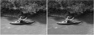
Channel Mixer in Photoshop lets you vary the proportion of the red, green and blue channels in a coloured image to change the relative brightness of colours when converting to black and white, and the next pair have used this to simulate the effect of filters, a red filter on the left hand image and a blue one on the right. The left hand one has a noticeably lighter boat, and has been given values of R100, G0 B0. The right hand one has darker water (which was a yellow brown) and a lighter cap (although you may have to look carefully to see that) and used values of R0 G0 B100.
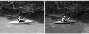
Despite this, you can see that no parts have turned completely black which shows that even though normal objects may have a very distinct colour, they are rarely monochromatic. Even the red boat is reflecting some blue light. The other point to note in this pair is the deep shadows. The rocks have been completely lost in the shadow in the red filtered photograph (remember shadow areas are illuminated by blue skylight) whereas they can be seen in the blue filtered photograph.
The left hand image here is a green filtered one (R0 G100 B0) and the foliage has become lighter and airier. In the right hand image above, the values used were R0 G50 B50. The remaining examples are the results of mixing the values a little more.
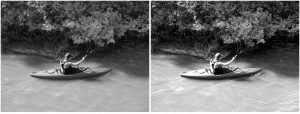
The final pair have the values for the left R30 G110 B50 and for the right hand side R30 G110 B0. Note the foliage and the water tones, and compare the results from the other settings.
Is a colour image the best starting point for black and white?
The ability to vary the colour in this way when using an image editing program, and perhaps even more importantly, being able to make such changes selectively (applying a different filter to each part of the image as you convert it to black and white), gives an extra degree of freedom to those who either use colour film and then scan or use digital cameras and capture a colour image. An additional advantage of using colour for black and white is that selections can be made based on the colour, rather than just the tone. If you can easily distinguish sky from leaves in this way, a selective adjustment is made far easier.
Going back to the rose photograph earlier, by selecting a single bloom it can be made to stand out from the others in black and white:
If you have a digital camera, the answer then is obvious – you start with a colour image and make the changes out of the camera. Film users face a more difficult choice. If you start with a colour negative, you have all the advantages above of being able to apply filters in a more controlled manner, and with a wider range of colours, than you would ever have available as physical filters. That is a very positive advantage. The much lower dynamic range of colour slide film and higher contrast of the resulting image makes it the worst choice for both image capture and scanning.
On the other hand, using black and white film has advantages as well. Black and white film has a greater resolving power than colour for the same ISO rating; and black and white film also offers the major advantage of being able to control the dynamic range of the film by processing. In conditions of very high or very low contrast, this could be enough to tip the scale in favour of the black and white. Black and white film is also cheaper to buy and easier to process yourself. Conventional black and white film does not depend on dyes for the image (unlike colour films and chromogenic black and white films) and therefore has a greater longevity. And, black and white film is less expensive!
The filters
Yellow
This is the most commonly used filter, and brings out white clouds in a blue sky to the amount that we would accept as natural. When most photographers used black and white film, a yellow filter was often left permanently fixed to the lens, as UV or skylight filters are today.
Like all the filters, it is available in lighter or deeper shades, with different filter factors, around the 2 or 3 times. One particular and useful variant is the “minus blue” version, which effectively reduces the blue and gives perhaps the best approximation to a sky with white fluffy clouds (when the sky is blue and has clouds).
One thing to keep in mind when using filters is that any parts of the scene illuminated by skylight rather than direct sunlight are being lit by blue light; and the more blue light you filter out, the darker the shadows will become (as we saw in the example above), and the greater the contrast between light and shade. This can be used with advantage to increase the rendering of the texture in the snow in snow scenes.
The effect on skin tones will not be too great; light skin and hair will be lightened, but blue eyes will be darkened. Freckles will be subdued, but not removed.
There are several different yellow filters, descriptively called light or pale yellow through to deep yellow, and with Wratten numbers 2A, 2B, 2C, 2E, 3, 5, 6, 8, 9, 12, and 15. No 12 is the “minus blue” we just referred to, and effectively cuts out blue light. It’s a popular choice amongst black and white photographers.
Orange
This works in a similar way to yellow, but with more noticeable effect. Some say that this is the strongest filter you can use on a sky and still have a natural look to the result.
Other effects are the lightening of sandstone, and it can improve the rendering of wood grain.
As the filter goes more towards red, used in portraiture it will hide skin blemishes, but also lighten lips.
This is the first filter that can have an unexpected result with foliage. Despite the visual appearance of green, leaves do actually start to reflect strongly in the far red region of the spectrum; an effect that is clearly shown in infra-red photography, where foliage appears white. With a dark orange filter, foliage can begin to be lightened, an effect called the “Wood effect” after Robert W. Wood, who pioneered both ultra violet and infra red photography.
Wratten numbers are 16 for a yellow-orange filter, 21 (orange) and 22 (deep orange).
Red
Use this to give black, dramatic skies; and watch out for the blocked shadows that can result from the reduction of the skylight illumination. Coupled with slight underexposure, this can be used to create a moonlight effect.
A red filter also gives the greatest haze penetration. The difference between two otherwise identical photographs of a distant landscape, one with a red filter and one without, can be dramatic.
As the filter moves more to red, so the effect on foliage will be greater. It is possible to have foliage lightened to a very considerable extent using a red filter.
Wratten numbers are 23 (light red), 24, 25, 25A, 26 and 29. There is also a magenta (or “minus green”) 32.
Green
Green filters get a mixed reception, with some photographers finding no use for them, and others making extensive use. The obvious effect is to lighten foliage in a scene, which can affect the mood of a landscape. Less obviously, it aids in the differentiation of greens, particularly in spring and early summer, when the difference between greens in foliage can be most pronounced. Used in portraits, it will darken skin tones and accentuate freckles and skin blemishes.
Wratten numbers 56, 58, 61, with 44 and 44A as blue-green.
Blue
This can be used with pan film to simulate ortho material, but why would you want to? Well, ortho was a popular choice for the “Hollywood portraits” of the 1940s. It darkens the skin (usually best used for male portraits) and lips, and has a look all its own. The darkening of lips was a problem with the early cinema films, and blue lipstick was used to make the actors appear more natural.
A blue filter will accentuate skin blemishes, so needs care on the choice of subject if this is not to create a very unflattering image.
And it will also act in the opposite way to a red filter, in increasing haze. This can be an advantage in some scenes, where the recession of tones enhances the feeling of depth in the photograph.
There are several different blue filters, but they are less commonly used. Wratten 38A, 47, 47A, 50 are some of them.
The pitfalls of black and white
The biggest potential problem is missing the fact that some tones in the image will convert to very similar shades of grey, and that therefore the subject will become confused. Outlines that were clear in colour can become merged in black and white. This is one good reason for starting with a colour image as the basis of a black and white conversion – the colour information can be used to ensure that differences remain.
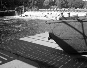
Take a look at this rusting barge. The barge was a warm, rust colour and was clearly differentiated from the water in colour. But in black and white, the tones merge and the outline is lost against the river behind. Given that the colours were different, a filter would have ensured that the tones did not merge; unfiltered, the outline is lost. Had this been taken on colour film (or in colour with a digital camera) this problem could have been easily corrected; as a black and white original, it cannot without a lot of work.
Viewing filters
It is possible to buy special viewing filters, usually a dark olive in colour, which you look through to eliminate colours and allow you to estimate how the tones will appear in black and white. The eye will adapt, however, so prolonged viewing will be counterproductive but they are a good way of checking that your interpretation is not too far from the mark.
Points to watch
The biggest thing to watch out for are the outlines of objects; as noted above, these may become confused after the colour has been removed. Colour images tend to be seen as blocks of colour, and black and white in terms of edges and outlines; so watching the outlines becomes more important than in colour.
Consider carefully the tonal variations, and whether a filter could or should be used not simply to preserve outlines, but to accentuate differences, or change the mood of a scene.
Filter factors
Light is not a constant colour. It’s warmer (more red) at the beginning and end of the day. Artificial light won’t have the same characteristics. This attribute of light is referred to as the colour temperature, and colour slide films are sold balanced for daylight or artificial light. The significance of this in black and white is that a red, orange or yellow filter will block a smaller proportion of the light depending on the colour temperature of the light. In practice, this can almost always be ignored. Well, it is by me anyway! What matters more is the type of black and white film.
The first photographic materials were effectively only sensitive to ultra violet and blue light – hence blue skies and white clouds are not distinguished in old photographs. It wasn’t too long before films could be sensitized to respond to light in the green and yellow end of the spectrum, and these films were sold as “orthochromatic”, showing the power of the ad men, as the word actually means “correct colours”, a description which not everyone would use when referring to a black and white photograph. Still, the term stuck. When film sensitivity finally got to the red end (about a hundred years ago) it was dubbed “panchromatic” or simply “pan”. The term means “all colours”, so perhaps more accurate at least in terms of what it responds to. It is possible to buy both ortho and pan films, although ortho is rarer.
The result of this is that filter factors do differ for ortho and pan films. Nowadays, it’s usual to quote just one typical value for a filter, which will be for pan film. Not so long ago, filter makers gave both figures, and the ones that follow are taken from a 1952 advertisement for Actina filters.
| Colour | Ortho Factor | Pan Factor |
| Light yellow | 2 | 1.5 |
| Medium yellow | 3 | 2 |
| Dark yellow | 4 | 3 |
| Light green | 3 | 2 |
| Medium green | 4 | 2 |
| Yellow green | 4 | 2 |
| Blue | 1.5 | |
| Orange | 4 | |
| Red | 8 | |
| Ultra violet (haze) | 1.5 | 1.5 |
To me the two interesting features are the presence of a factor for a UV filter (usually taken as “no factor”) and the extra exposure ortho needs with a green filter.